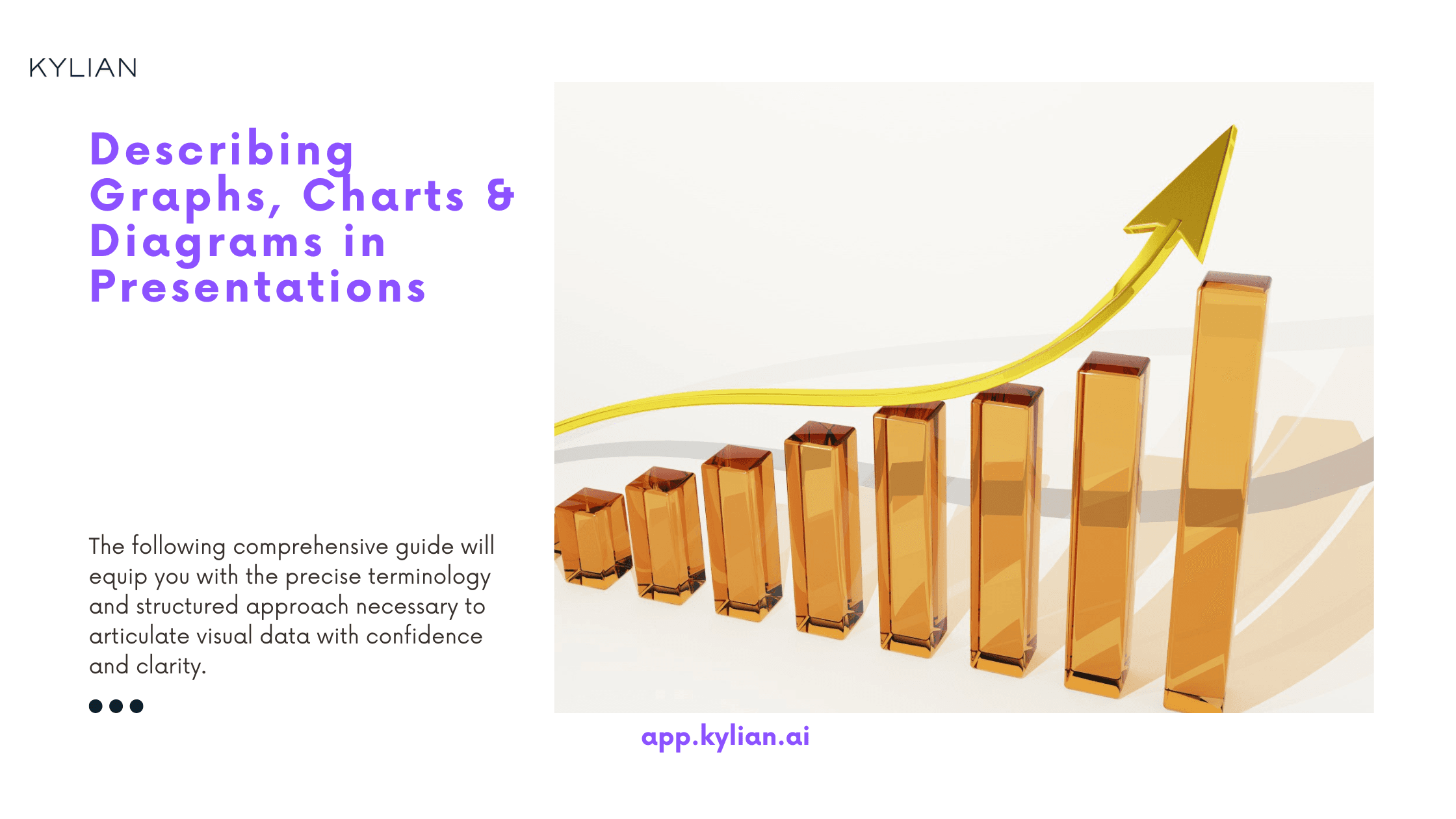
Describing Graphs, Charts & Diagrams in Presentations

Written by
Ernest Bio Bogore

Reviewed by
Ibrahim Litinine
The ability to effectively communicate data through visual elements transforms ordinary presentations into compelling narratives. When you master the vocabulary and techniques for describing graphs, charts, and diagrams in English, you position yourself not just as a presenter, but as an authoritative guide who can translate complex information into accessible insights.
For non-native English speakers, this skill becomes particularly crucial—whether you're preparing for high-stakes business presentations or standardized language assessments like the IELTS, where data visualization interpretation frequently appears. The following comprehensive guide will equip you with the precise terminology and structured approach necessary to articulate visual data with confidence and clarity.
Why Effective Graph Description Matters in Presentations
Presentations laden with numbers and statistics risk losing audience engagement without proper contextualization. The strategic implementation of visuals—charts, graphs, and diagrams—transforms abstract data into tangible evidence that supports your core arguments and retains viewer attention.
When you can articulate the significance behind these visuals, you accomplish three critical objectives:
- You demonstrate expertise in your subject matter
- You provide concrete, evidence-based support for your assertions
- You make complex information digestible for diverse audiences
For language learners preparing for examinations like the IELTS, mastering this skill is non-negotiable. The Academic IELTS Writing Task 1 frequently requires candidates to interpret and describe data visualizations within a limited timeframe, testing both language proficiency and analytical capabilities.
The Framework for Effective Graph Description
To describe any visualization effectively, follow this four-stage approach that ensures comprehensive yet focused analysis:
1. Introduce the Visualization
Begin by establishing the fundamental context of what your audience is seeing. This introduction should concisely cover:
- The visualization type (line graph, bar chart, pie chart, etc.)
- The specific subject matter being represented
- The data source (if relevant for establishing credibility)
- The time frame or scope represented
This introductory framing orients your audience and provides necessary background before diving into specifics. Consider these professional examples:
"This line graph illustrates the fluctuation of global oil prices between 2010 and 2023."
"The following pie chart represents the market share distribution among the top five smartphone manufacturers as of Q2 2024."
"This comparative bar chart, using data from the International Energy Agency, shows renewable energy adoption rates across major economies."
2. Identify Key Variables and Features
After introducing the visualization, direct attention to its structural elements:
- Explain what the axes represent in a graph (vertical/horizontal)
- Identify what different colors, patterns, or symbols indicate
- Highlight the units of measurement
- Note the scale used and any significant benchmarks
Appropriate phrases for this stage include:
"The vertical axis measures annual revenue in billions of dollars."
"The horizontal axis represents quarterly periods from 2021 through 2023."
"The blue bars indicate domestic sales, while the orange segments represent international market performance."
"The shaded regions highlight periods of economic recession."
3. Analyze Significant Patterns and Trends
With the foundation established, move to the analytical core by identifying and explaining the most significant information displayed. This requires:
- Highlighting primary trends (increases, decreases, stability)
- Noting exceptional data points or outliers
- Making meaningful comparisons between different elements
- Identifying correlations or relationships between variables
The language you choose should precisely match the data behavior. Consider these categories of descriptive vocabulary:
Movement Verbs:
- For increases: rise, grow, climb, surge, escalate, spike
- For decreases: fall, decline, drop, plummet, decrease, diminish
- For stability: stabilize, plateau, remain constant, maintain, level off
Descriptive Modifiers (Adjectives):
- For magnitude: substantial, significant, dramatic, marginal, slight
- For velocity: rapid, gradual, sudden, steady, accelerating
- For consistency: consistent, erratic, volatile, periodic
Intensifiers (Adverbs):
- sharply, dramatically, marginally, moderately, steadily, gradually
The combination of these terms allows for precise characterization of data behavior. For example:
"Renewable energy investment rose steadily between 2015 and 2019, before surging dramatically in 2020."
"Manufacturing output plummeted sharply during Q2 2022, followed by a gradual recovery through the remainder of the year."
"Customer acquisition costs remained relatively stable for established markets but fluctuated significantly in emerging regions."
4. Provide Meaningful Conclusions
Finally, transition from description to interpretation by explaining the significance of what the data reveals. This analytical component demonstrates deeper understanding by addressing:
- Implications of the observed patterns
- Potential causes or contributing factors
- Future projections based on visible trends
- Recommended actions informed by the data
This stage elevates your presentation from mere description to actionable intelligence. Consider these transition phrases:
"These figures clearly indicate that..."
"Based on this trend, we can anticipate..."
"The data suggests several strategic implications, primarily..."
"This pattern reinforces our hypothesis that..."
Specific Techniques for Different Visualization Types
Line Graph Description Techniques
Line graphs excel at displaying continuous data changes over time, making them ideal for trend analysis. When describing line graphs:
- Follow the line progression chronologically, noting directional changes
- Identify peak and trough points with specific values when significant
- Compare rates of change between different periods
- Highlight any recurring patterns or cycles
Example description framework: "This line graph tracks monthly active users for our platform throughout 2023. Starting at 1.2 million users in January, we see a modest growth phase through Q1, averaging 3% monthly increases. In April, there's a pronounced spike to 1.5 million users, coinciding with our product launch. The subsequent plateau through summer months reflects market saturation, before another growth phase begins in September. The year concludes with 1.8 million users, representing a 50% annual increase."
Bar Chart Description Techniques
Bar charts excel at comparative analysis between discrete categories. When describing these:
- Identify the arrangement pattern (ascending/descending or categorical)
- Highlight the highest and lowest categories with specific values
- Group similar categories when analyzing multiple variables
- Note proportional relationships between different categories
Example description approach: "This horizontal bar chart compares annual carbon emissions across five industrial sectors in 2023. Manufacturing generates the highest emissions at 42 million tons, nearly double the next highest category. Energy production and transportation show comparable figures at 24 and 22 million tons respectively. Agriculture and commercial sectors have significantly lower emissions, both under 10 million tons. This distribution confirms manufacturing as our primary focus area for emission reduction initiatives."
Pie Chart Description Techniques
Pie charts visualize proportional relationships within a whole. Their effective description requires:
- Identifying the largest and smallest segments first
- Grouping similar categories when logical
- Converting visual proportions to percentage figures
- Making meaningful comparisons between segments
Example description strategy: "This pie chart illustrates global smartphone market share distribution for Q1 2024. Samsung maintains the largest segment at 28%, followed closely by Apple at 26%. These two manufacturers together control over half the global market. Chinese manufacturers collectively hold 35%, split between Xiaomi (15%), Oppo (12%), and Vivo (8%). The remaining 11% belongs to smaller manufacturers, representing a fragmented portion of the market. This distribution demonstrates the continued dominance of established brands despite growing competition."
Grammar Considerations for Graph Descriptions
The grammatical choices you make when describing visualizations should align with the temporal nature of the data presented. Consider these tense guidelines:
Past Simple: Use for historical data with a defined endpoint
- "Oil prices peaked in 2008 before falling dramatically in 2009."
Present Perfect: Use for trends starting in the past and continuing to the present
- "Housing costs have risen consistently since 2015."
Present Simple: Use for current states or general trends
- "The data indicates a strong correlation between education level and income."
Future Forms: Use for predictions or projections
- "Based on current trends, renewable energy capacity will exceed fossil fuel generation by 2030."
Additionally, comparative structures frequently appear in effective descriptions:
- "Exports were 15% higher in Q4 than in Q3."
- "Company A's growth rate is twice that of Company B."
- "Investment in AI startups is significantly lower than in the previous year."
Essential Terminology for Graph and Chart Elements
Graph Terminology
Understanding the fundamental elements of graphs ensures precise communication:
- Dataset: The complete collection of values represented in the visualization
- Data point: An individual value within the dataset
- Data series: A set of related data points, typically shown in the same color or pattern
- X-axis: The horizontal reference line (typically representing the independent variable)
- Y-axis: The vertical reference line (typically representing the dependent variable)
- Origin: The intersection point of the x and y axes, usually at zero
- Scale: The incremental values along an axis
- Gridlines: Horizontal or vertical lines extending from axis divisions to aid in reading values
- Legend: The key explaining what different colors, patterns, or symbols represent
- Title: The descriptive heading identifying the visualization's subject matter
Chart-Specific Elements
Different chart types feature specialized components:
Line Graphs:
- Trend line: The linear or curved line connecting data points
- Slope: The steepness of line segments, indicating rate of change
- Intersection point: Where two or more lines cross, indicating equal values
Bar Charts:
- Bars/columns: Rectangular elements representing values
- Stacked bars: Segmented bars showing component parts of a whole
- Clustered bars: Grouped bars enabling direct comparisons between categories
Pie Charts:
- Segments/slices: Wedge-shaped sections representing proportional values
- Exploded segment: A slice pulled away from the main circle for emphasis
- Donut chart: A variant with a hollow center, sometimes used for multiple data series
Presentation Techniques for Maximum Impact
Opening Your Visualization Discussion
The transition into and introduction of your visualization creates the framework for audience understanding. Consider these opening techniques:
- Direct attention: "I'd like to draw your attention to this bar chart showing quarterly revenue growth."
- Establish relevance: "To understand why this trend matters, let's examine this line graph of customer acquisition costs."
- Pose a question: "What factors are driving this market shift? This pie chart provides insight into the changing consumer preferences."
- Connect to previous points: "Building on the strategy I just outlined, this diagram illustrates our implementation timeline."
Language Precision and Flow
The clarity of your visualization explanation depends on:
- Logical progression: Move from general overview to specific insights
- Transitional phrases: Use connectors like "furthermore," "consequently," or "in contrast" to link observations
- Parallel structure: Maintain consistent grammatical patterns when comparing multiple elements
- Varied vocabulary: Avoid repetitive descriptions by employing diverse terminology
Connecting Visualizations to Your Broader Narrative
For maximum impact, integrate your data visualization explanations into your overall presentation narrative:
- Forecasting: Before showing the visualization, explain why it matters
- Contextualizing: After description, connect insights to your broader argument
- Reinforcing: Reference back to visualization insights when making related points later
- Bookending: Return to key visual insights in your conclusion to reinforce main takeaways
Digital Tools for Creating Effective Visualizations
The quality of your visualization directly impacts how effectively you can describe it. Consider these industry-standard tools for creating professional graphs and charts:
Microsoft Excel
Key Features:
- Comprehensive library of chart types
- Robust data management capabilities
- Extensive formatting options
- Integration with other Microsoft Office applications
Best For:
- Financial analysis and modeling
- Complex data manipulation
- Business reporting
- Situations requiring offline functionality
Google Sheets
Key Features:
- Cloud-based collaboration
- Real-time editing and sharing
- Integration with Google Forms for data collection
- Accessible from any device with internet connection
Best For:
- Team projects requiring simultaneous access
- Remote collaboration scenarios
- Situations where data frequently updates
- Cross-platform compatibility needs
Tableau
Key Features:
- Advanced visualization capabilities
- Interactive dashboards
- Data storytelling features
- Extensive customization options
Best For:
- Business intelligence applications
- Complex data storytelling
- Data exploration and discovery
- Creating compelling visual narratives
Plotly
Key Features:
- Scientific and technical visualizations
- Interactive charts
- Programming language integration (Python, R, JavaScript)
- Web-based sharing capabilities
Best For:
- Scientific research presentations
- Technical data visualization
- Custom application development
- When interactivity is essential
Canva
Key Features:
- User-friendly interface
- Design-focused templates
- Social media optimization
- Branding consistency features
Best For:
- Marketing presentations
- Social media content
- Brand storytelling
- When aesthetic appeal is paramount
Datawrapper
Key Features:
- Journalistic-quality charts
- Responsive design for different screens
- Embedding capabilities for digital content
- Focus on clear communication
Best For:
- Media and publishing
- Web content creation
- When minimalist, clear design is essential
- Digital storytelling
Enhancing Your Graph Description Skills
Developing expertise in visualization description requires deliberate practice. Consider these improvement strategies:
Regular Analysis Practice
Set aside time to interpret published graphs and charts from sources like:
- Financial publications (The Economist, Financial Times)
- Research reports from your industry
- Government economic and statistical releases
- Annual reports from major corporations
Practice writing or verbally describing these visualizations using the techniques outlined in this guide.
Recording and Reviewing
When practicing presentation delivery:
- Record yourself explaining visualizations
- Review your recordings, noting areas for improvement
- Focus on eliminating filler words and hesitations
- Work on smoothly transitioning between data points
Vocabulary Expansion
Build a personal lexicon of terms for different data behaviors. Create categorized lists of:
- Verbs for different types of movement
- Adjectives for different magnitudes
- Adverbs for different intensities or speeds
- Transitions for comparing different elements
Expert Guidance
Consider working with:
- Business English coaches who specialize in presentation skills
- Data visualization experts who can provide feedback on your interpretations
- Industry professionals who regularly present data in your field
Their targeted feedback can accelerate your development beyond what self-study alone provides.
Common Pitfalls to Avoid
Even experienced presenters can undermine their effectiveness by falling into these common traps:
Information Overload
Problem: Attempting to describe every data point rather than focusing on significant patterns.
Solution: Prioritize 3-5 key insights that directly support your main argument. For complex visualizations, consider breaking them into segments for clearer explanation.
Terminology Inconsistency
Problem: Switching between different terms for the same elements, creating confusion.
Solution: Establish your terminology at the outset and maintain consistency throughout your description.
Neglecting Context
Problem: Describing raw data without explaining its relevance or implications.
Solution: Always connect your data observations to their practical significance for your audience.
Reading Without Interpreting
Problem: Simply stating what the audience can already see rather than providing analysis.
Solution: Focus on answering "So what?" for each observation—explain why the pattern matters, not just that it exists.
Learn Any Language with Kylian AI
Private language lessons are expensive. Paying between 15 and 50 euros per lesson isn’t realistic for most people—especially when dozens of sessions are needed to see real progress.
Many learners give up on language learning due to these high costs, missing out on valuable professional and personal opportunities.
That’s why we created Kylian: to make language learning accessible to everyone and help people master a foreign language without breaking the bank.
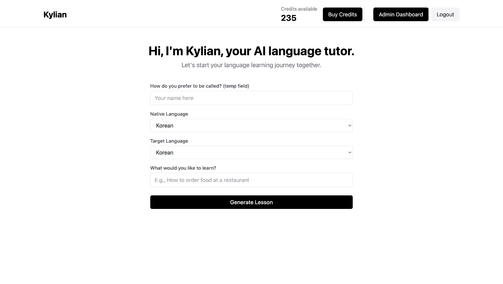
To get started, just tell Kylian which language you want to learn and what your native language is
Tired of teachers who don’t understand your specific struggles as a French speaker? Kylian’s advantage lies in its ability to teach any language using your native tongue as the foundation.
Unlike generic apps that offer the same content to everyone, Kylian explains concepts in your native language (French) and switches to the target language when necessary—perfectly adapting to your level and needs.
This personalization removes the frustration and confusion that are so common in traditional language learning.
Choose a specific topic you want to learn
Frustrated by language lessons that never cover exactly what you need? Kylian can teach you any aspect of a language—from pronunciation to advanced grammar—by focusing on your specific goals.
Avoid vague requests like “How can I improve my accent?” and be precise: “How do I pronounce the R like a native English speaker?” or “How do I conjugate the verb ‘to be’ in the present tense?”
With Kylian, you’ll never again pay for irrelevant content or feel embarrassed asking “too basic” questions to a teacher. Your learning plan is entirely personalized.
Once you’ve chosen your topic, just hit the “Generate a Lesson” button, and within seconds, you’ll get a lesson designed exclusively for you.
Join the room to begin your lesson
The session feels like a one-on-one language class with a human tutor—but without the high price or time constraints.
In a 25-minute lesson, Kylian teaches exactly what you need to know about your chosen topic: the nuances that textbooks never explain, key cultural differences between French and your target language, grammar rules, and much more.

Ever felt frustrated trying to keep up with a native-speaking teacher, or embarrassed to ask for something to be repeated? With Kylian, that problem disappears. It switches intelligently between French and the target language depending on your level, helping you understand every concept at your own pace.
During the lesson, Kylian uses role-plays, real-life examples, and adapts to your learning style. Didn’t understand something? No problem—you can pause Kylian anytime to ask for clarification, without fear of being judged.

Ask all the questions you want, repeat sections if needed, and customize your learning experience in ways traditional teachers and generic apps simply can’t match.

With 24/7 access at a fraction of the cost of private lessons, Kylian removes all the barriers that have kept you from mastering the language you’ve always wanted to learn.

Similar Content You Might Want To Read

Beyond "I Want": Diverse Expressions of Desire in English
Communication in English requires more than just basic vocabulary. When expressing desires and wishes, relying solely on the phrase "I want" limits your expressiveness and can make your speech sound repetitive or even demanding. Native English speakers utilize a rich variety of expressions to convey their desires with different levels of intensity, formality, and emotional nuance. This article examines the diverse ways to express desires in English, offering alternatives that will elevate your communication skills and help you sound more like a native speaker. Rather than sticking to the basic "I want," you'll discover how to articulate your desires with precision and cultural appropriateness across various situations.

Ways to Say "Good Luck" in English: Beyond the Basics
Life presents countless moments when we want to offer encouragement to those we care about. Whether it's a job interview, an academic examination, a creative performance, or any challenging endeavor, expressing our support through well-wishes can provide meaningful motivation. While "good luck" serves as the standard expression, the English language offers a rich tapestry of alternatives that can convey more specific sentiments, appropriate for various contexts and relationships. This comprehensive guide explores diverse expressions beyond the basic "good luck" phrase, examining their meanings, appropriate contexts, and cultural considerations. By expanding your vocabulary of supportive expressions, you'll be equipped to offer more personalized, impactful encouragement that resonates with the recipient and the situation they face.

Animal Sounds in English: How Animals Communicate
The animal kingdom resonates with a rich tapestry of sounds—from the subtle buzzing of insects to the thunderous roars of large predators. These sounds aren't merely acoustic phenomena; they're sophisticated communication tools that serve critical functions within and across species. This comprehensive guide explores the diverse range of animal sounds, their significance in both the natural world and human culture, and the specific English terminology used to describe them.

Better Ways to Say "I Like" and "I Don't Like" in English
Do you find yourself repeatedly using the same phrases to express your preferences? The ability to articulate what you enjoy or dislike with precision and variety not only enriches your conversations but also demonstrates language proficiency. This article explores alternative expressions to the common "I like" and "I don't like" statements, providing you with a diverse vocabulary arsenal to communicate your preferences more effectively.

Ama Meaning: Understanding This English Popular Slang Term
In the ever-evolving landscape of digital communication, slang terms continually emerge and transform the way we interact online. "Ama" stands as a perfect example of this linguistic evolution—a concise yet powerful acronym that has seamlessly integrated into our digital vernacular. This term, which stands for "Ask Me Anything," has revolutionized how individuals engage with audiences across various platforms, creating spaces for unfiltered dialogue and authentic connection. The significance of understanding slang terms like "Ama" extends beyond mere linguistic curiosity. As digital communication continues to dominate professional and personal interactions, familiarity with these terms becomes increasingly valuable. They serve as cultural touchpoints, signaling one's fluency in digital discourse and ability to navigate contemporary communication landscapes effectively. This comprehensive guide delves into the origins, applications, and cultural impact of "Ama," offering you insights into how this slang term functions within digital spaces. Whether you're encountering "Ama" for the first time or seeking to deepen your understanding of its nuances, this exploration will equip you with the knowledge to engage confidently with this prevalent piece of modern internet lexicon.

Canadian Slang: From Poutine to Double-Double
Slang forms the backbone of cultural identity, acting as linguistic shorthand that separates insiders from outsiders. In Canada—a country known for its cultural diversity, sprawling geography, and unique national identity—slang serves as more than just informal vocabulary. It's a cultural passport that differentiates those who understand the nuances of Canadian communication from those who don't. When someone mentions "going for a rip" or asks if you want to "grab a double-double," they're not speaking in code—they're using distinctly Canadian expressions that carry cultural weight. Mastering these terms isn't just about expanding vocabulary; it's about gaining authentic entry into Canadian culture. Through extensive analysis of social media conversations, regional linguistic patterns, and cultural significance, we've compiled a comprehensive guide to Canadian slang. Whether you're planning to visit the Great White North, communicating with Canadian colleagues, or simply fascinated by linguistic variation, understanding these terms will transform you from bewildered outsider to cultural insider.
